“Am I fitter than I was this time last year?” is a simple question that has always been surprisingly hard to answer. Your gut says yes, or no, or maybe. Your rides from last June are buried somewhere in a list. And the number most people reach for, FTP, tells you where you are today, but not how you got there or where you were on the same date a year ago.
My Seasons answers it directly. It’s a new page under Home that overlays your seasons on one set of charts, so you can see the shape of each year and compare them date for date.
Already on Xert? Open My Seasons.
Pick Your Years
Choose the months you care about (the page opens on January to October as an example range, and you can set any range), then switch on the years you want to compare. The current year and last year are one click away, and every earlier year you have data for sits beside them, up to twelve at once. Each year gets its own colour. If you have a Forecast AI plan that reaches into next year, a Next Year pill with a dotted line appears too, so you can compare a planned season with your past ones (more on that below).
The pills at the top tell you what each line means. Solid lines are seasons you’ve ridden, such as the current year in navy and last year in teal. The dotted line is Next Year, your planned season, which is a forecast rather than completed rides.

The first chart is your Total Training Load, with a table next to it that gives each year’s training load at the start, high and end of the range, your training status, and the distance, hours and days you actually rode.
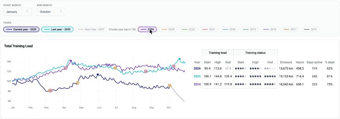
That one chart already tells you a lot. In our example, 2026 started from a similar place to 2024 and 2025, but without a late-season race (the UCI Gravel World Championships) this athlete built far less load through the summer.
Your Threshold Power, Year over Year
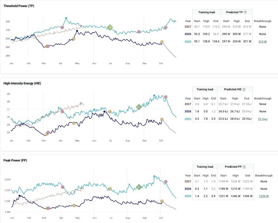
Below the training load you’ll find charts for Threshold Power (TP), High Intensity Energy (HIE) and Peak Power (PP). TP is the one most athletes look at first. It’s the closest thing Xert has to what other platforms call FTP, and it’s the number you want to see move.
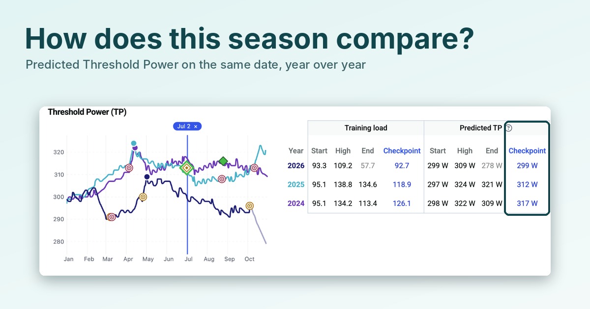
Each chart has a table with the predicted start, high and end values for every season you’ve selected, plus the best breakthrough of the year when there was one. Here, 2025 started the year at a predicted 297 W, peaked at 324 W and finished at 321 W. 2024 went from 298 W to 322 W and ended at 309 W. This year so far, TP started at 299 W and has peaked at 309 W.
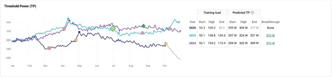
A note on reading the numbers: My Seasons predicts TP, HIE and PP from your training load relative to your best breakthrough of the season, so they can differ a little from the signature on any single activity. The question mark beside “Predicted” explains how it works. Your recorded activity signatures are still the source of truth for any single ride, so use these charts to compare the shape and direction of your seasons.
Compare on One Date
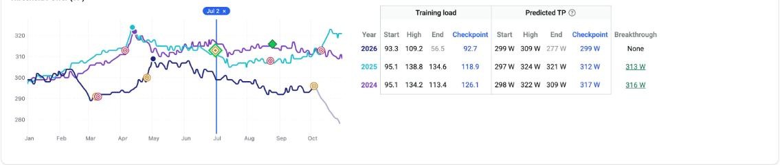
Click anywhere on a chart and My Seasons drops a checkpoint on that date. Every table gains a Checkpoint column showing each year’s value on that day, so you can read off exactly where you were at the same point in each season. Click the date pill at the top (it has an ×) to clear it.
Our checkpoint on July 2 shows predicted TP of 299 W this year, 312 W in 2025 and 317 W in 2024. That’s a clear picture of how this season compares with the last two on the same date, and whether you’re ahead of or behind where you were.
Signature or Training Load
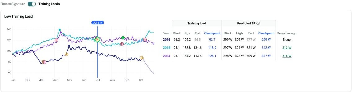
The switch above the TP, HIE and PP charts changes what they show. Leave it on Fitness Signature to see the predicted TP, HIE and PP. Flip it to Training Loads to see the low, high and peak training loads behind them. It’s the quickest way to find out whether a better year came from more of the easy work, the hard work, or both.
Your Races and Events on the Chart
Races and events you’ve tagged in Xert appear on the charts as target icons: crimson for a Race, amber for an Event. A diamond marks a breakthrough. Together they let you see how your fitness and load were building before the days that mattered, and how your best seasons were put together. If you haven’t tagged your key rides yet, our article on activity tags shows how, and it takes a few minutes to mark a whole season.
Plan Next Year
My Seasons can also look forward. If you have a Forecast AI plan that reaches into next year, a Next Year pill with a dotted line appears with the other years. Turn it on and your planned season joins the comparison, so you can check a new plan against your best past seasons before you commit to it. We walk through that in Plan Ahead.
Try It Yourself
- Open Home, then My Seasons.
- Set the months you want, and switch on your last three or four years.
- Look at the Threshold Power chart and note your predicted high in each year.
- Click the chart on a date that matters to you, such as the start of your build, to see where you were at that point in each season.
- Flip the switch to Training Loads to see what each season was made of.
New to Xert? Start your 30-day free trial at www.xertonline.com.